The Recap of Adfectus at MOJO'22
- 5 minsThis week I was lucky to be at MOJO’22, the game showcasing event at Técnico Lisboa. My presence was defined in two different roles, first off I am a teaching assistant in the course of Game Development Methodology (GDM), secondly, I am a Game Developer showcasing Adfectus.
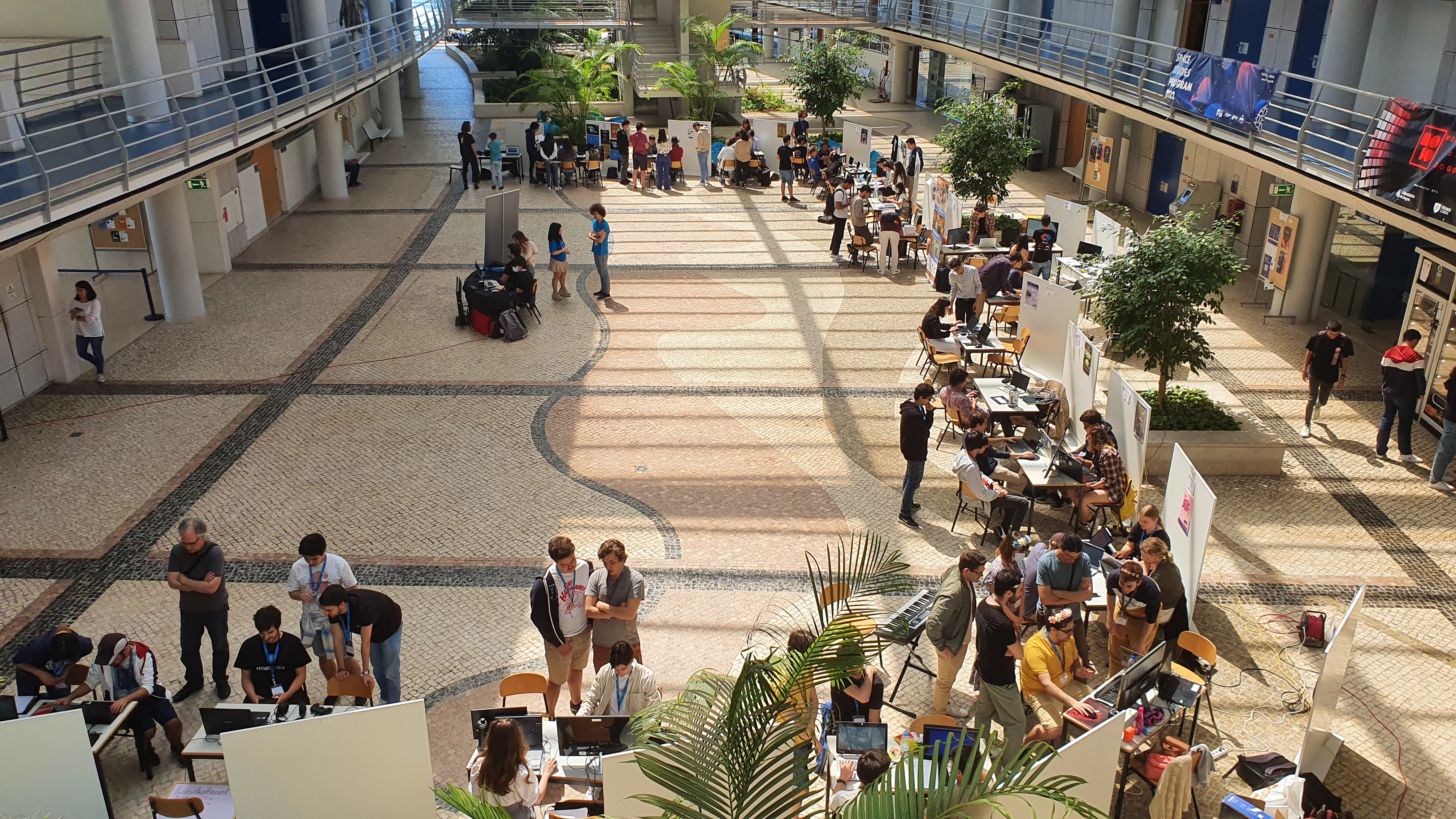
The event was originally designed as a showcase of the games developed in the GDM course but grew to host also other student projects that are related to games. As a teaching assistant, I was tasked to evaluate most of the games from the GDM course, and while it is a lot of fun, it is also very time and energy-consuming. A lot of games offered interesting mechanics and, while quality varies a lot from game to game, I advise you to try out the games (that are available on the MOJO’22 Website).
As a side-note, a team from RTP Arena visited the event and played the games. They also interviewed the organizers and the GDM head professor for a blog post available on their website.
The responsibilities of my first role also meant that I wasn’t able to be around my booth showcasing my game, nevertheless, Adfectus captured some attention and I wanted to share a small recap of its presence at MOJO.
Pre-Event
In preparation for the event, it was necessary to step up a couple of things. First, build the game for different platforms, in my case Linux, Windows, and macOS, and upload them to itch.io. The build allows me to share the game online for anyone to play and also to have an easy way to download and install the game on any computer to showcase the game at the event (before the event I wasn’t sure what computer I was going to use).
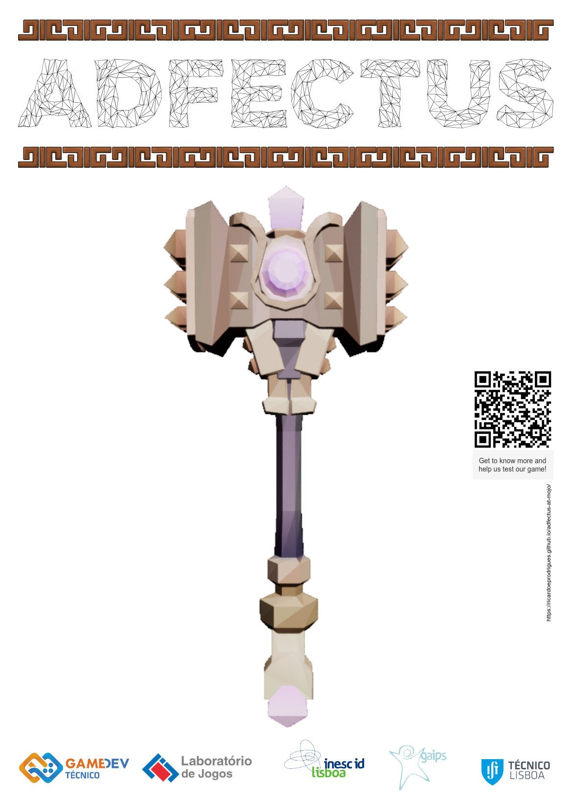
I also prepared a set of items to display at the booth: a poster, a controls cheatsheet, and a suggestion box (with paper and pens). I choose a clean and simple look and made use of game elements (3D and 2D) to design the items. All items also had a QR code that linked them to the previous blog post “Adfectus at MOJO”, this code allowed more people to more easily visit the website.
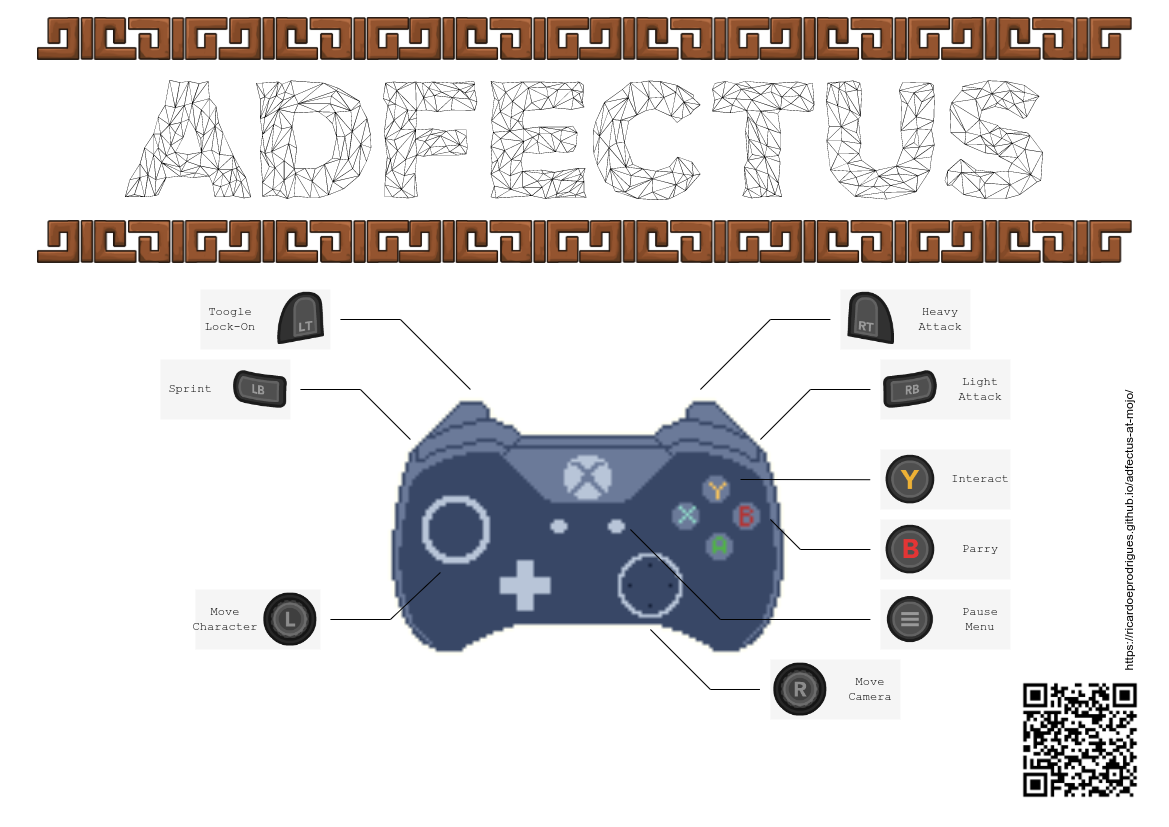
For the controls cheatsheet, I was able to find a good image of a controller, along with controller buttons icons made freely available by Xelu, I could easily design the image below.
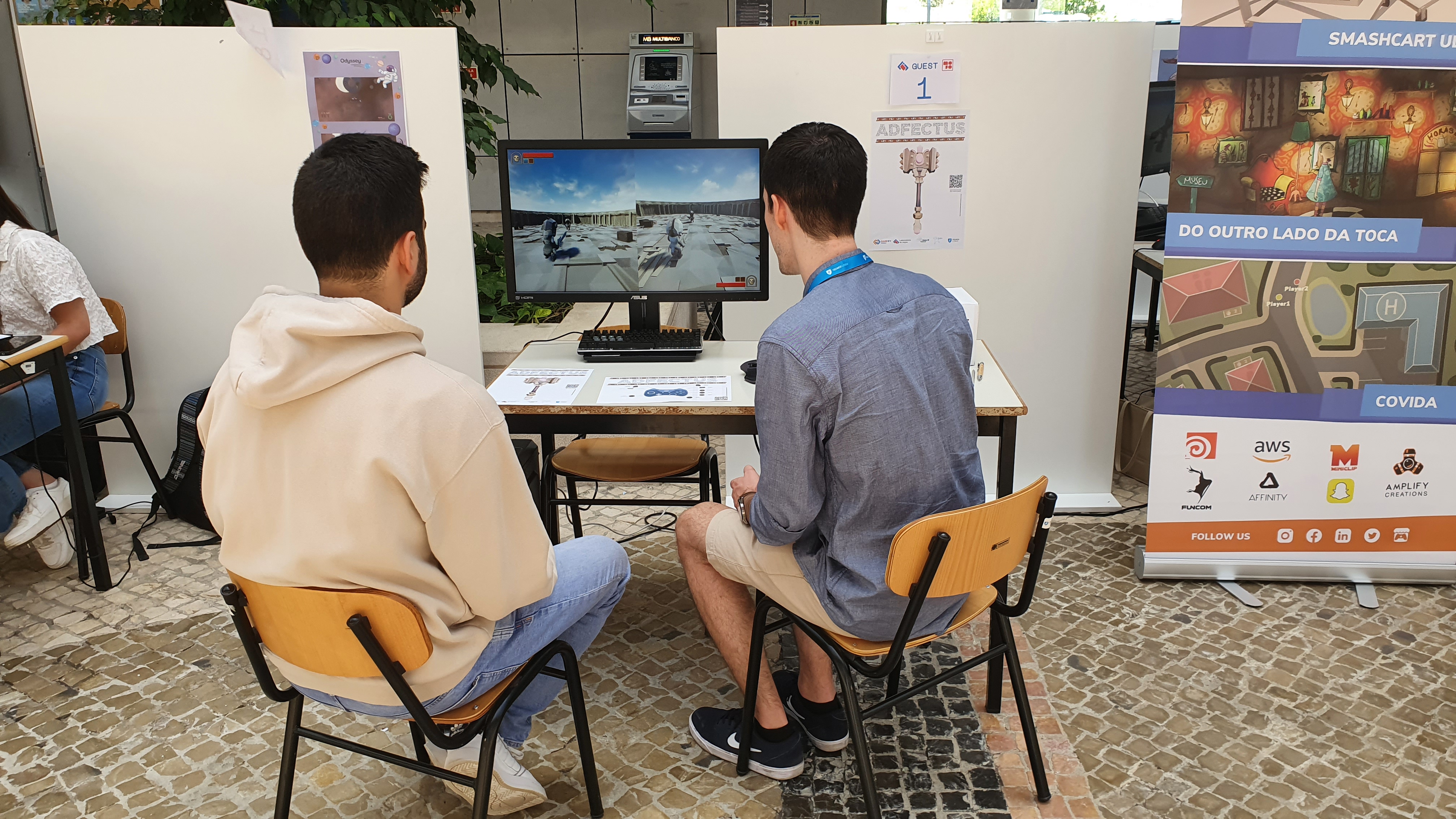
Having all the things I needed, I made my way to set things up at the event. My laptop is too weak to run the game, therefore I needed to carry my desktop (and mouse, and keyboard, and cables) to the event, luckily the event was at my workplace and I just needed to carry it downstairs, and the event organizers (LabJogos) provided me with an amazing monitor for me to use. The hassle of setting up the desktop computer shows a big restriction on showcasing the game elsewhere without a good enough laptop (this is relevant for future events).
In Event
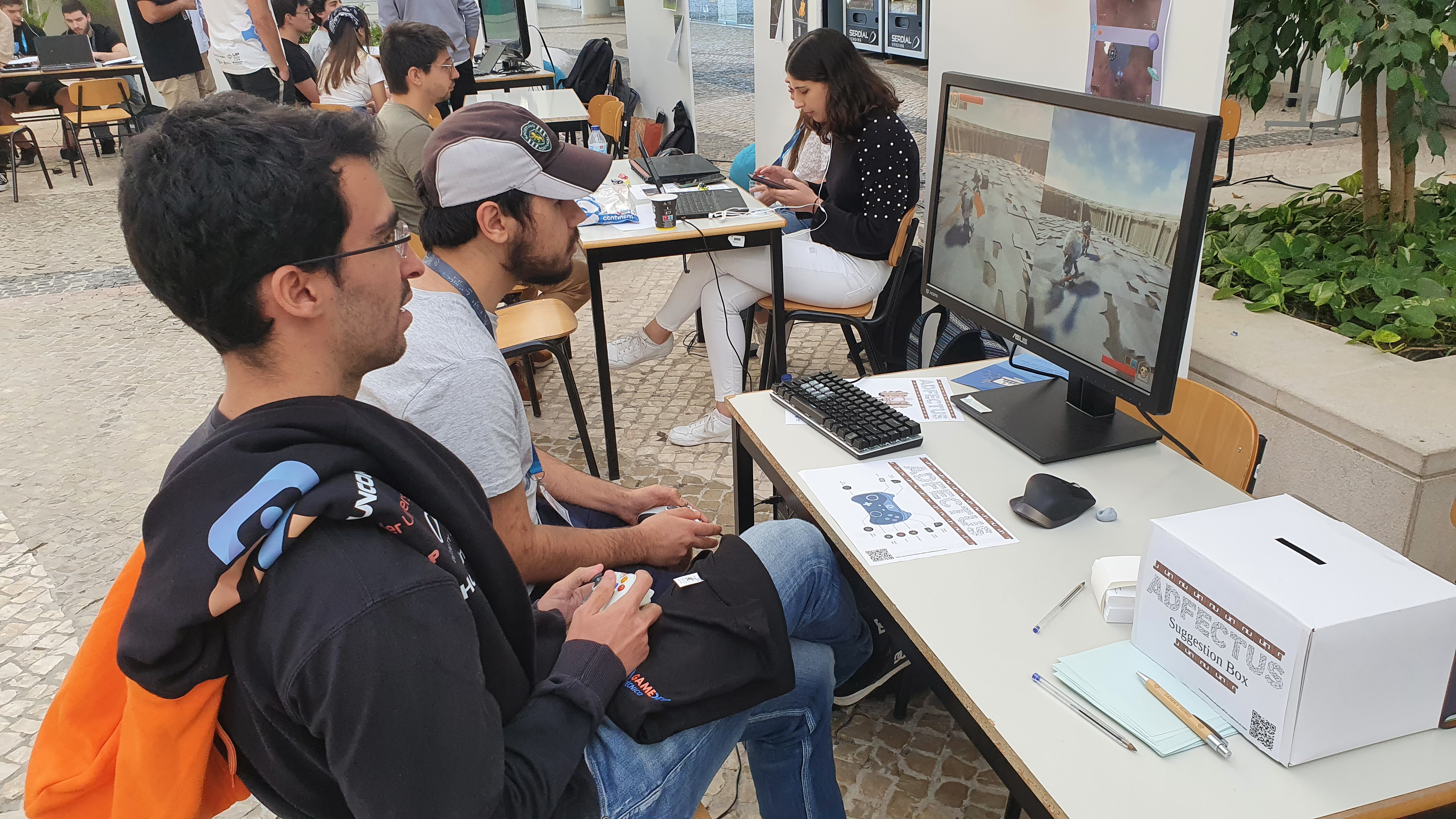
As previously mentioned, I wasn’t able to stick by the booth for large amounts of time. While I was away, few people interacted with the game, and fewer still read the QR code or made written suggestions. Yet, when I was near the booth and was able to invite onlookers to play, a small crowd would join and watch. I was able to speak with some of them and gather some feedback, I promptly invited them to write the suggestions down on paper and put them in the box. (Stick with your booth, or you won’t have feedback.)
Early on I noticed something off with the game, while it wasn’t game-breaking it was providing a different gameplay experience than the one I was expecting. The issue was simple: weapons were dealing too much damage. In my lack of time and rushing things, I changed the damage amount dealt by weapons but clearly didn’t test it enough. While this experience bug was noticed, players seemed to enjoy the game. From observing some of them, I noticed that they particularly enjoyed the feeling of defeating their opponent (but without formal evaluation, these are just my assumptions).
Post-Event
At the end of the day, no other noteworthy bugs were found, neither technical nor experiential. Furthermore, the suggestion box had received 7 suggestion notes. All suggestions will be considered, but not all might be added to the game (which is normal, but good to point out). Here are some of the suggestions collected:
-
More feedback on hits/health.
- Make parry more noticeable.
- Make a red vignette appear when a player is closer to defeat.
- Add ability to Dodge.
-
Hit damage is unbalanced.
- Fast attacks appear slower than heavy attacks (look into axe and sword attacks)
- This problem is partially due to an error on the build.
-
The camera should be over the left shoulder.
- The participant justified it by saying that it is easier to see the opponent’s attack, as their weapon is on the character’s right hand.
-
Limit Sprint.
- Stamina bar, recovery period, or delay between sprints.
In closing, while no response was received on the online form, the results of the event were positive. For the first time, Adfectus received player feedback “in the wild” and it seemed players enjoyed it. The game seems good enough to share around and if you want to play it click on the link below.
Additionally, if you are interested in the game and would like to participate in future experiments on it, I invite you to fill out this form.
